

Information visualization plays a pivotal role in the analysis of data. It can be described as an outstanding tool of understanding the patterns and structures in data sets. Python has the edge because it is a leading language for data analytics and visualization, thanks to the broad array of powerful libraries that have made it possible to construct intricate visualizations.
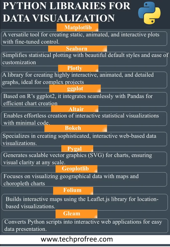
Python Libraries for Data Visualization for data visualizations
Here is the list of some top python Libraries for Data Visualization for data visualizations.
- Matplotlib
- Plotly
- Seaborn
- ggplot
- Altair
- Bokeh
- Pygal
- Geoplotlib
- Folium
- Gleam
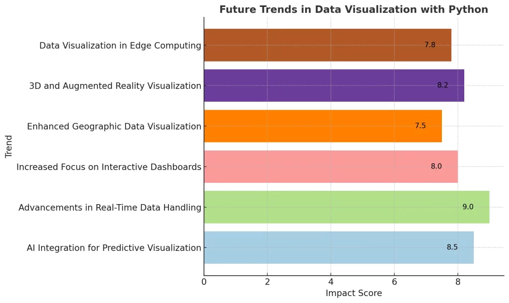
Future Trends In Data Visualization With Python
These are among the Python libraries that are very powerful in the creation of many types of data visualization including the customizable ones thus giving analysts and statisticians a chance to build visual models that suit their needs.
Matplotlib
As the most prominent data visualization toolkit, matplotlib generates static, interactive and animated visual representations. It offers a wide range of tools and widgets that permit users to do even the finest tunning of parameters, including color schemes and axis limits. At the same time as the initial hurdles may be a factor, Matplotlib provides a variety of benefits such as cross-platform compatibility, open-source usability, and a highly active user community.
Seaborn
Seaborn is a supplement to Matplotlib which surpasses static visualization while at the same time sustaining specification. Seaborn is a library that is built over Matplotlib’s foundation. Therefore is a convenient option for developers who want to integrate the functionalities that it brings. The connection between Matplotlib and Seaborn through this collaboration opens up new horizons of data visualization, which makes it possible to create both informative and aesthetically appealing pictures. Seaborn allows the availability of various templates and themes. Moreover, the Seaborn community is highly active by offering documentation that is easy to understand and shareable examples contribute to the overall development.
Plotly
It becomes a sophisticated tool for developers who are skilled in the use of the tools and can create animated graphics in different formats. It gives developers a toolkit with a diversity of options which makes it easy to run complex projects with a high-quality and large-scale.
Yet, it should be noted that while Plotly is open source, some advanced features may require you to purchase a license, which must be your decision-making criterion.
ggplot
ggplot is an R-rooted library whose top-down API makes data visualization easy and integrates seamlessly with the pandas Data Frames. Using ggplot has a great impact on the speed of building charts through the automatic pairing of variables with aesthetics; the flexibility of customization may be slightly restricted. However, ggplot is compatible with pandas which allows unbroken data management and processing.
Altair
Altair, as a code word for Vega and Vega-Lite, simplifies the construction of interactive statistics visualizations with low coding demands. It provides users with a great deal of plot types, which allows the data visualization to be efficient and convenient while keeping the visual appeal. By default, Altair’s dependencies include Python 3.6, NumPy, Pandas and Toolz which are auto-installed, saving installation time and integration stresses.
Bokeh
Bokeh with clear roots in The Grammar of Graphics, provides granular visualizations with a collaborative component for datasets. Because it is part of Python, Bokeh comprises three progressive levels of control for visualization creation, choosing according to the expertise level of the end user. Bokeh’s scope is not limited to the visualization of interactive web applications, HTML documents, and JSON objects only, but it is described as the preferred tool for data visualization experts.
Pygal
Python data visualization library/tool with features in common with Plotly or Bokeh. It is created for chart creation purposes. Amongst the most striking factors that set Pygal apart is the ability to portray charts in the SVG format, which is responsible for the clarity of the visuals even on zooming. The other way around, SVGs can face downfalls with the large data which in turn can result in a lag in the performance.
Geoplotlib
Providing diverse types of maps, for example, dot-density and choropleths, Geoplotlib becomes an essential geographical data visualization resource. However, Geoplotlib adds two new libraries to the list which are NumPy and pyglet as prerequisites. Unlike other libraries, Geoplotlib is the best way to create maps within various Python packages.
Comparing Top Python Libraries for Data Visualization
Comparing Top Python Libraries for Data Visualization based on Features, Interactivity, and Customization Options
| Library | Ease of Use | Interactivity | Types of Visualizations | Customization Features |
| Matplotlib | Moderate | Static/Interactive | 2D, 3D | High |
| Seaborn | Easy | Static | 2D | Moderate |
| Plotly | Moderate | Interactive | 2D, 3D | High |
| ggplot | Easy | Static | 2D | Low |
| Altair | Easy | Interactive | 2D | Moderate |
| Bokeh | Moderate | Interactive | 2D, 3D | High |
| Pygal | Easy | Static | 2D | Low |
| Geoplotlib | Moderate | Static | Geographic | Moderate |
| Folium | Easy | Interactive | Geographic | Moderate |
| Gleam | Easy | Interactive | 2D | Moderate |
Performance and Use Case
Performance and Use Case Comparison of Top 10 Python Data Visualization Libraries
| Library | Rendering Speed | Interactivity | 3D Support | Use Case Suitability |
| Matplotlib | Medium (static images) | Limited (static by default) | Basic (limited with mplot3d) | Data science, academic visuals |
| Plotly | Fast (interactive visuals) | High (supports hover, zoom) | Advanced (supports full 3D) | Business dashboards, analytics |
| Seaborn | Medium (built on Matplotlib) | Limited | None | Data science |
| Bokeh | Fast (interactive web apps) | High (supports browser usage) | Moderate | Web-based, real-time analytics |
| ggplot | Medium | Limited | None | Data science |
| Altair | Medium | High (interactive by design) | None | Interactive stats visualizations |
| Pygal | Medium | Limited | None | SVG-based static charts |
| Geoplotlib | Medium | Limited | Limited | Geographic mapping |
| Folium | Medium | Limited | None | Geographic mapping |
| Gleam | Medium | Moderate | None | Web applications |
Summary
Python is undoubtedly the best language for data science, and its data visualization libraries are one of the main reasons for this. This article has presented a general idea of what Matplotlib, Seaborn, Plotly, ggplot, Altair, Bokeh, Pygal, Geoplotlib and Folium are capable of. Every library contributes its own part to the whole. With Python, you can be a professional data scientist or a data analyst and you can use the data visualization ecosystem to create compelling stories out of raw data that help you to make informed decisions. That is only the start of your journey. Go further into these repositories, utilize their online communities and empower Python to unleash the real power of your data.